The Mink Car Design Tour is a feature created by The Chopping Block for tmbg.com in 2001, to provide fans a peek into the process of creating the album's graphic design. It has been archived and reformatted here for preservation.
Introduction[edit]
This is a little tour of the design process for what became They Might Be Giants newest release "Mink Car". We (The Chopping Block) know how fans like to see all kinds of background stuff and we thought some of this might be a little interesting to glance at.
– Tom Romer, Designer
The Chopping Block, Inc.

|

|
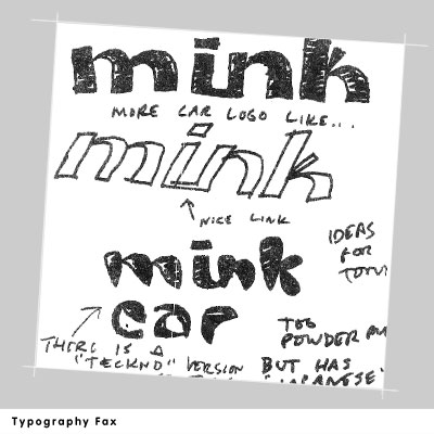
| This was the original fax from John Flansburgh for concepting the typographic logo for both the album name as well as the name of the band. It was based on something he saw somewhere and just struck him as hip and cool enough for the new release. There were, as you will see, many ideas back and forth before "landing" the right type design for the new look.
|
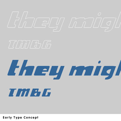
Based on conversation, some type sketches from Rob Reed and an old Nascar font I did for a racing novel. None of them seemed to be right for the album, but good on their own standing.
|

|

|
| A combination of that racing novel font and the idea John Flansburgh was faxing to us. Still, John wasn't feeling the love yet.
|
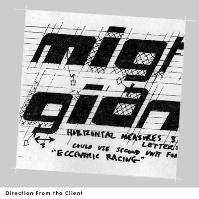
Alas, pen, paper and ruler in hand, John maps out exactly what he's thinking. The concept is really based on a simple grid. Almost digital. It was from this faxed type spec that we developed all the letters needed and added various refinements.
|

|

|
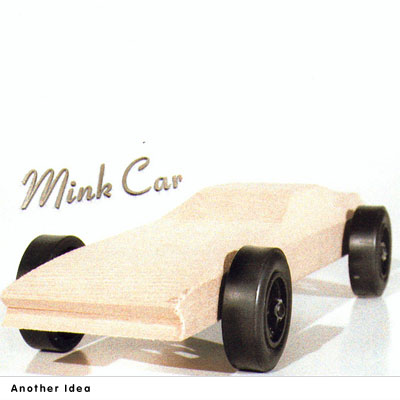
| So began the layout and concept design. We had laid out around 25 very rough concepts from renders to photos to pencil sketches. This was just one of many that featured a wooden racecar like the ones Boy Scouts paint up.
|
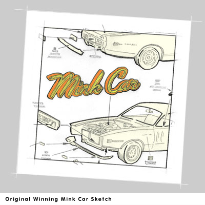
Another of the roughs presented was the "model" idea. Here the Mink Car on the album would actually be a model of a "Mink Car" and would be presented the same way the model car instruction booklets illustrate the assembly process.
As you can see this is the sketch that ultimately dictated the layout and concept seen on the actual disc as well.
|

|

|
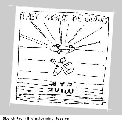
The laying out of the many roughs and the decision to continue exploring the "model" idea lead ultimately to a brainstorming session with Flansburgh. The idea that the car would be a souped up "affordable" family car, like a Honda as well as the idea of the "model" man actually getting hit by the model of the mink car was carved during in this session.
Pictured here is the actual sketch Flansburgh penned based on the earlier sketch and what we were currently discussing.
|
This is simply an early attempt to integrate the existing "model" sketch with the new elements developed with Flansburgh.
|

|

|
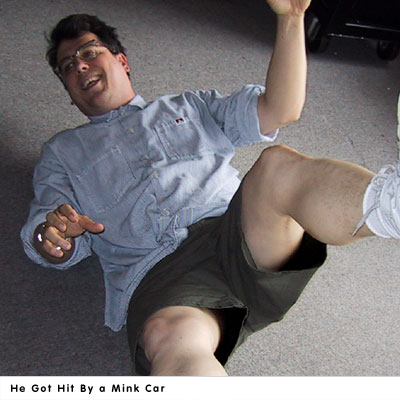
| You got it. The man himself posed as the model for the accident victim on the cover. This is the actual image that was traced... line them up together every detail is there.
|
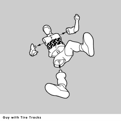
An idea that was nixed was placing tire treads on the pedestrian victim. What's funny here was the logic why we shouldn't... they couldn't put the tire treads on the model unless it was a decal or painted on. In that case, the assembly instruction booklets don't ever show the model with the decals actually placed on. They only show the decal with arrows pointing to where it should go.
|

|

|
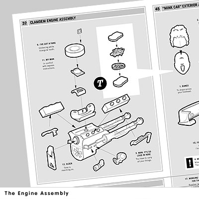
| Another alternate you will not find on any of the pressings was this "Engine Assembly" from the inside of the booklet. This item was nixed at the very last minute in favor of the "Pedestrian Re-Assembly" diagram which is really much smarter.
|
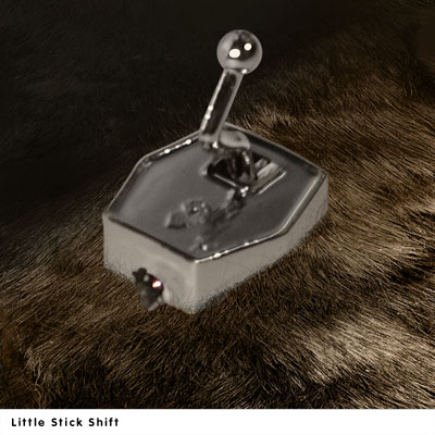
Finally, the "under the disc" art was originally conceived as a macro shot of an actual tiny chromed stickshift coming out of actual mink fur. However the fur became too large once you zoomed in that close and it didn't feel attached at the base to the fur.
Pictured here is that fur and tiny stickshift brought together through the magic of photoshop. They just didn't seem like they were from the same world though. So we shot pictures of a model wheel and merged that with the image of fur. This worked out much better, not to mention the round wheel fit conceptually better since it would appear under a round disc.
|
See also[edit]
